
 Hundreds of millions of people, including more than 330 million people saw these iconic letters in 2017.
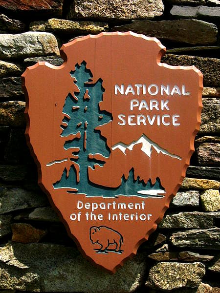
They are all over our national parks.
The letters spell a variety of messages. They identify a park. That pond. A path. An overlook. Everything you see in a park.
Yet, ironically, that familiar, popular type of lettering could only be found outdoors.
That was until Jeremy Shellhorn came around.
Shellhorn worked as a designer-in-residence for Rocky Mountain National Park back in 2013.
The story goes he was creating the park's newsletter when he discovered there wasn't an actual version of the font that is used on all those national park signs, not only the park in Colorado, but national parks across America.
With a little research, he discovered the park signs were actually created by a device called a Computer Numerical Control router that carves the letters into the wood to make that distinctive clean look with the rounded edges.
As an associate professor of design at the University of Kansas, Shellhorn started a class he called the Design Outside Studio.
He initiated a project for the students to create a font based on those park signs. (The class has also been involved in a number of other outdoor projects, such as creating signage to promote "Leave No Trace.")
For the lettering, the students actually went out into the field and made pencil rubbings from the signs to get a true replica of the unique look and feel of those letters.
The group went to work and created this unique font. It's currently called "National Park Typeface," that can be now be used online and in print.
The new font was released last year.
Where to obtain the national park font
There are four versions - light, regular, heavy and outline.
And the great feature is, they made the font available for free.
The designers' efforts are well appreciated for a number of reasons.
For one, they have now preserved this unique outdoorsy typestyle that has graced park signs for decades.
Who knows, one day the national park service may come up with a new type of sign and all those wooden posts will go away.
Secondly, designers and even ordinary folks now get to transport this familiar lettering out of the woods and onto websites, print materials and all sorts of projects.
And finally, and this is a major benefit, when people view that font while being indoors, for many it will transform them back to a memory of being outdoors in one of our incredible national parks.
Perhaps sitting on park benches on a trail surrounded by oak and pine trees. Walking on smooth rocks across a chilly creek. Maybe setting up a campsite and getting ready to cook a fun meal on an outdoor park grill. Or perhaps walking up to a wooden rail fence and peering out over an enormous canyon.
Use of typeface helps with branding for our national parks (and the outdoors)
Americans spend more time than ever inside, sitting at desks, driving in long commutes or surfing the web from a couch in their home.
The National Park font will be a nice reminder that this country is blessed with an incredible number of great national parks, 61 in all. (They just added one in Indiana).
That doesn't count the 418 park sites maintained by the National Park Service.
Then you have all those wonderful state parks.
There are 10,234 of them according to the National Association of State Park Directors.
And if you can't get to a national or state park, there is always that local park down the road.
Many times just getting out in any park and enjoying a respite from the indoor, digital and television world can be a relief.
As we wrote repeatedly on this website, there are tremendous mental and physical benefits to the outdoors.
Soaking some Vitamin D on your skin from the sun, breathing fresh air created by all those green trees and moving those limbs is great for human begins.
There may be thousands of typefaces out there.
But that National Park font is definitely something special.
Those iconic letters carry quite a bit of meaning behind them.
When you see the park typeface on a website or in print, take a moment to appreciate it.
And then make a note on your calendar to get out and see those letters on those trail signs in person.